Case Study
Scan2Dine
A menu interface designed for decisions made under pressure.
What I Designed
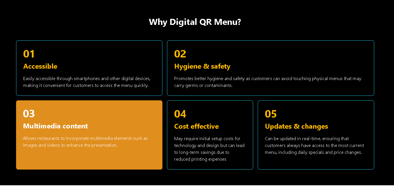
A QR-first ordering interface built for one-handed use at a seated table.
A menu hierarchy readable in a single glance, even in low light.
An order flow reduced to the fewest taps needed to complete a decision.
A shipped frontend, deployed and tested against real restaurant conditions.
Problem
Restaurant menus are designed to be read in calm; they are used in noise, hunger, and hesitation.
Intent
Build a menu interface that absorbs the pressure of the moment instead of adding to it.
Approach
Designing Real Conditions
The interface was tested against the table, not the desktop. Type sizes, contrast, and tap zones were sized for low light and a held phone.
Minimum Interaction Path
Every tap between hunger and order was traced and challenged. What remained is the shortest path possible without losing clarity.
Hierarchy Through Clarity
Categories carry the structure; items carry the decision. Nothing competes for the eye that does not also carry weight in the choice.
Built And Shipped
The design was carried through to a deployed frontend, not handed off as a file. Production constraints shaped the final interface as much as the research did.
Design Decisions
Type was sized for arm’s-length reading, not for screen review.
Categories were reduced until the full menu could be understood in one scroll.
The cart was kept persistent so the order never had to be remembered.
Imagery was reserved for dishes that carried decision weight.
Confirmation was made unmistakable so no guest leaves the screen unsure.
Outcome
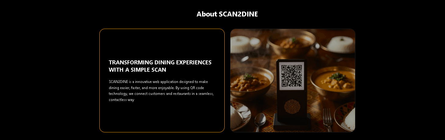
A live ordering interface that holds its clarity under the conditions a real table actually creates.
Deployed and in use. The interface carried its restraint from prototype through production.