Case Study
Q-Less
A queue interface designed to make the wait feel known, not endured.
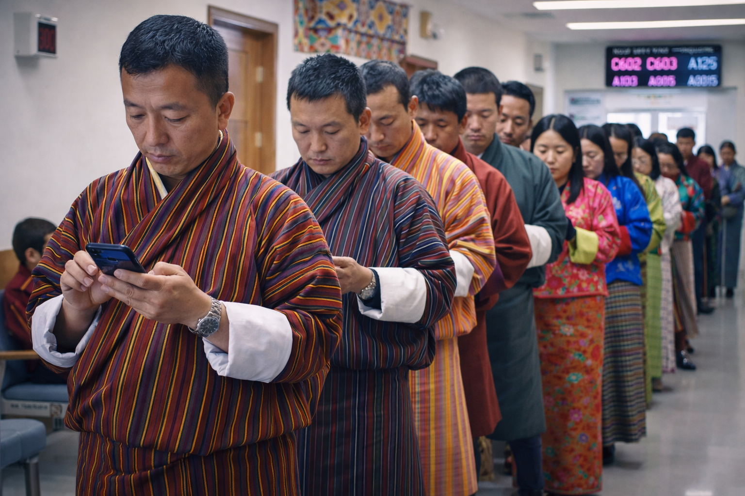
What I Designed
A queue interface designed to keep position and progress continuously visible.
A position display calibrated for legibility from across a waiting room.
An update rhythm calibrated to reassure without creating restlessness.
A shipped frontend, deployed and tested in the conditions waiting actually creates.
Problem
Waiting is rarely about time. It is about not knowing what the time means.
Intent
Build a queue interface that makes the wait understandable, not shorter.
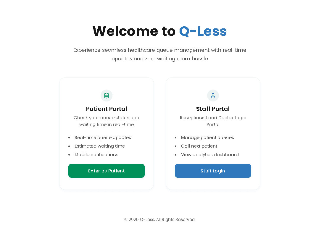
Approach
Studying The Wait
The first work was not interface work. It was observing how people behave when a system asks them to wait without explaining the wait itself. Most visible stress came from absence of information, not length of time.
Designing For Visibility
The interface was built around the two questions a waiting person actually asks: where am I, and how much longer. Everything else was removed until those two answers held the screen on their own.
Pacing The Information
Updates were tuned to the rhythm of attention, not the rhythm of the data. The interval was chosen so the interface feels active without feeling restless.
Built And Shipped
The system moved from prototype to deployed frontend without losing its restraint. What was designed to feel calm on a quiet screen still felt calm in a busy room.
Design Decisions
Position was made the largest element on the screen, because it is the only number a waiting person actually wants to see.
Estimated time remained visibly flexible, because honesty creates more trust than precision.
Updates were paced to feel attentive rather than anxious, so the screen never trains the user to keep checking it.
Status changes were made unmistakable, so no person standing up has to wonder whether they were called.
The interface was kept intentionally quiet, so the moments it speaks carry more weight.
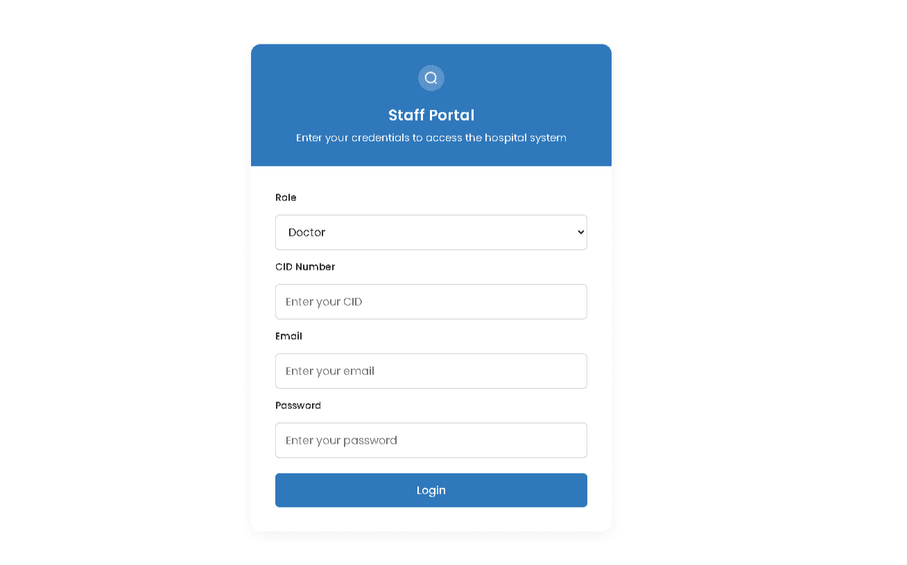
Outcome
A queue interface that holds its calm in the rooms that need it most.
Deployed and in use. The restraint built into the interface survived the conditions it was designed for.